Finance sector
Financial products explained plainly, by audience.
People researching a financial product want to understand the conditions, the fees and what is expected of them before committing. We organise the site by audience and situation, with factual content, readable application paths and a clear place for regulatory information.
In-house products and delivered sites





What's your profile?
Expertise adapted to your business
Goal
Help each audience find the right product and prepare their application.
Audiences
Individuals, self-employed, businesses, young professionals.
Key pages
Accounts, cards, credit, savings, fees, conditions, help.
Conversion
Account opening, simulation, appointment.
Web challenges
The challenges specific to your sector
A financial website has to be transparent, guide without advising and stay compliant. Three requirements guide how these sites are built.
Make fees and conditions readable
Problem
Fees and conditions often live in regulatory PDFs that are hard to connect to the relevant product.
Solution
We summarise fees and conditions on the product page, with a link to the official document and a last-updated date.
Indicator
Views of fee pages, qualified contacts, recurring support questions.
Guide by situation, not by catalogue
Problem
A menu organised by product only speaks to insiders; everyone else does not know where to start.
Solution
We create entry points by audience and life event, linked to the relevant products and journeys.
Indicator
Journeys taken, request completion, exit pages.
Fit compliance in without weighing the site down
Problem
Mandatory notices are sometimes stacked in one place, or scattered until they become impossible to find.
Solution
We provide a structured regulatory area and a validation workflow with your teams, so every piece of content stays up to date.
Indicator
Validation lead times, updates published, corrections requested.
Details that make the difference
What Synara does that others don't
Fees and conditions only in a regulatory PDF.
A summary of fees and conditions next to the relevant product.
A product-based menu, unreadable for newcomers.
Entry points by audience and concrete need.
Vague wording that avoids mentioning risks.
What is covered and what is not, stated factually.
Regulatory notices isolated in the footer.
An identifiable, up-to-date regulatory area.
Expertise
Our expertise at the service of your sector

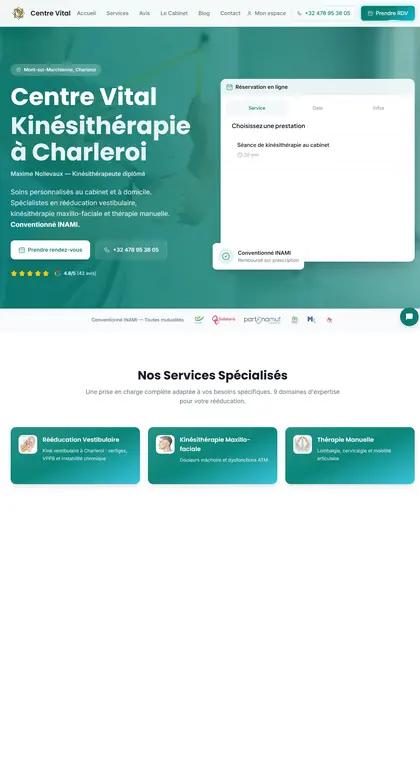
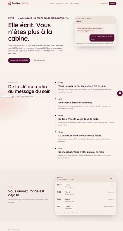
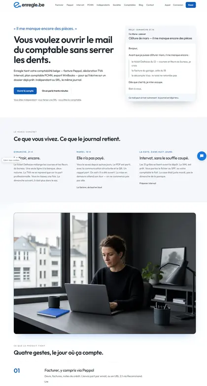
In Belgium
How your customers choose you
In Belgium, someone comparing financial services rarely arrives from a single advert. They open several sites, check a comparison tool, then return to the institution whose conditions they understand. Hidden fees and technical vocabulary are the first reasons for giving up. The site must therefore state clearly what is included, what is charged and what remains the client's cost, without drowning those answers in a general document. Clients also want to know whether they can complete the process online, book an appointment at a nearby branch or talk to someone when a file is stuck. Trust is built on precision and stable information, not slogans. A dated page consistent with official documents does more for conversion than a promise.
What they type into Google
- free current account belgium
- car loan simulation charleroi
- open bank account online belgium
- pension savings comparison
- business account self-employed liège
- switch banks brussels
In practice
What we set up for you
- A product page summarising conditions, fees and exclusions before the application path.
- Entry points by situation — self-employed, family, property project — linked to the right products.
- An application path that lists the documents needed before starting.
- A dated regulatory area, kept current with your compliance team.
- An internal comparison limited to the offers you actually provide, with no misleading ranking.
Let's talk about your offer: thirty minutes to make your conditions understandable before the first meeting even happens.
Book 30 minutesQuestions
Before you write
Can you write about our financial products?
We write factual content from your documents, with no investment recommendation and no return promises. Your compliance team validates before publication.
How do we handle several audiences on one site?
With distinct entry points per audience, linked to the same product pages. We avoid duplicating every piece of content, which ends up creating contradictory versions.
Does the site need a simulator?
Only if it is realistic to maintain and aligned with your calculation rules. An approximate simulator with poor explanations does more harm than good.
How do we talk about our rates without freezing prices that change often?
We separate pricing principles from exact amounts, and date every grid. The site explains what affects the cost and points to the current official grid. A dated, clear page stays credible even when conditions change twice a year.
Should all legal notices be grouped on a single page?
No. We keep one page that gathers them, but each product shows the notices that concern it where the decision is made. Visitors should not have to hunt for a general document to understand the limits of a specific offer.
How do you reassure a visitor comparing several institutions?
By clearly showing what is included, what is charged and what remains the client's cost, without burying the exceptions. An honest comparison is better than a single highlighted advantage, because the visitor will check elsewhere anyway.
Explore other sectors
See all sectorsWealth management
Expertise, client situations and method that lead to a qualified first conversation.
Physiotherapist
Specialities, team and practical information without detours, through to booking.
Luxury
A precise, desirable digital experience that extends the codes of the house.
Masonry
Projects, types of work and coverage area to show quality before the site visit.
Notary
Expertise, procedures and team presented to reassure before the first appointment.
Pharmacy
Opening hours, access, services and support at hand, without complicating the team's day.


Let's get started!
Let's get down to business.
Tell us where you stand — we reply within 24 hours with a free first review.


Get ready:you're going to love it.
 you're going to love it.